
rends are EVERYWHERE, whether that is what is trending in the news, what the hot new clothing trend is, or what the sign/design trends are in looking like in 2022!
Below is a sneak peak of what we have gathered will be the color trends, font trends, tech trends, and logo trends this year. So what do you say, ready to be a trend setter?
2022 is the year of neutral color palettes. Brands are stepping back from vivid and bold color trends and are veering toward more muted colors and neutral color palettes. Muted colors are simply colors that have been slightly desaturated with black, white, or a complementary color. Neutral colors are muted shades that appear to lack color but often have underlying hues that change with different lighting. Examples of neutral colors include tan, gray, cream, brown, black, white and some blues.

Popular fonts for 2022 will have an open and honest personality, with legibility and web accessibility a priority. These font trends may be subtle, but they’re all supremely stylish. Many designers are using heavy fonts to create contrast and hierarchy by pairing them with simple backgrounds and lighter fonts.

This past year we have seen some digital displays go from horizontal to vertical. We will continue to see more of this in the upcoming year due to the fact that people are used to viewing things on a cell phone, and turning the display vertically gives that same feel as a cell phone screen. As phones continue to have higher resolution screens so do digital displays, leading people to invest in digital displays that are 8 mm or less.

An effective business card will not make an effective sign. The information printed on a business card works because the person who has that card has the time to study & compute the information. Using that same information & logo on a sign creates too much chaos. Remember LESS IS MORE.
Experimenting with Line Thickness: Varying line thicknesses plays with balance to give additional depth and complexity.
Stretched & Continuous Lettering: Stretched and continuous lettering creates a boundary less, infinite look and feel.
White Space Finds Imagery: Interchanging white space with imagery gives negative space a whole new look and feel.
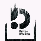
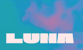
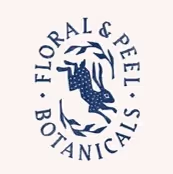
Layered Elements: Exploring geometric forms, fonts and color blended to create classic logos, with a twist.
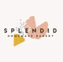
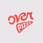
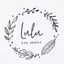
Scribbles & Sketches: Heading in the direction of simplicity and art, giving off a natural and honest vibe.
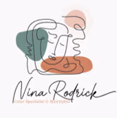
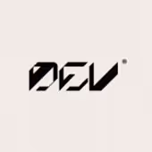
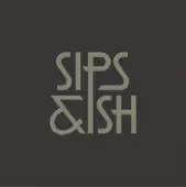
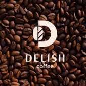
Typography Takes Shape: Wordmark logos, where the logos’ lettering communicates the brands personality
I hope this helps. Buying a sign is a huge investment and should be treated as such. Make sure you work with a company who thoughtfully considers all aspects of your business. I can think of one :). Feel free to contact us, we would love to help with your new signage in anyway.
Some information and photos sourced from:
https://design.tutsplus.com/, https://www.business2community.com/, https://99designs.com/, and https://www.thisismeagankerr.com
We thank you for making a payment on your purchase. Please select the option below that best describes your payment.


